May be the second time I've found a genuinely insightful piece by Gruber. Skeuomorphic design was a nod to my non-computer using father in the 90s. It no more represents useful metaphors for interfaces than steam engines represent a good way to build cars.
iOS is stagnant, reviews of recent Apple designed skeuo-heavy apps bemone the lack of functionality -- while noting what must be hundreds of hours of graphics work -- and not seeing that the tradeoff is worth it. With finite development hours the general public realizes that they'd rather get shit done then look really great sorta getting some things done.
So who makes the money at Apple? It's two people, Cook and Ive -- supply chain and product design. Let's give turning the entire device design over to a holistic human interface designer a try instead of running hardware and software as two disjoint efforts.
Between Siri and the maps screw up the decision made itself.
iOS only seems stagnant because they don't have to trumpet every year about how they've finally gotten rid of ui lag or completely overhauled the system appearance. These are points in it's favor to most people.
I suppose, iOS hit a higher quality product much earlier than Android. But to me it feels like an evolutionary dead-end. Sure they aren't fixing any problems, but they sure aren't really adding anything to make my life better.
Or another evolutionary analogy: crocodiles have more or less been around forever -- they don't have to trumpet about solving calorie intake problems, or overheating in the summer, but it took mammals to invent fire and get to the moon.
Saying more or less "iOS is fine" is also saying "we're not interested in pushing the envelope anymore".
It'd help me if you gave examples what you think iOS could be doing that's it not. The big ticket feature that iOS didn't have 60 days ago was built in turn by turn maps. Since they added that with 6.0 I guess I'm wondering what else you're pining for? A weather widget? NFC? Fjords?
The biggest feature would be adding OS X/NeXT services/Android intents: currently it's impossible to have two apps interact without the developers explicitly baking in support. Allowing applications to establish some conventions for services ("Open web page", "View PDF", "Retrieve login information", "Subscribe to feed", "Post to {network}", etc.) would make the massive improvements from the integrated Twitter/Facebook support available for to all apps and services.
This would also be a smart move for Apple as de-privileging Twitter & Facebook would mean that they wouldn't be helping support the lockin for those services – if Google Plus came back from the dead and started eating Facebook's marketshare, Apple would benefit without changing a line of code.
I'm principally talking about look and feel. iOS looks and operates great, let's get that out of the way. But it's essentially the same core design that was laid out in 2007 + Androidish notifications + multitasking-lite. At a glance can the average user tell the difference between iOS 2 or 3 and 6?
I acknowledge that that's not necessarily an entirely worthy goal in and of itself, but keeping a design focused product fresh does have its merits.
Other than the obvious lack of a wallpaper I'm not really sure that there's been any fundamental work on improving the user interaction and look & feel of the thing in 5 years.
I find it unbelievable that there's nothing that could be done better and that iOS was launched with perfect interaction design, fully formed from the heads of the designers, or perfect visual design, reverently propagated to the modern day and on into the future.
Is this really the penultimate in volume slider design? There's no more work to be done here?
I think this recent shakeup is Apple signaling that it's time to evolve again and that excites me much more than the last 2 or 3 product launches have.
If anybody can put out a new way of pushing electrons around and making it "just work" it's going to be Apple and I want to see what they come up with.
All of what you've listed is just repeating the same point: iOS hasn't changed much since its inception. But you're still not answering the question: what needs to change?
Don't get me wrong, it's not that I think it can't be improved, because I can think of a few needed improvements myself. But I hear people continue to say this about Apple -- "They aren't innovating lately." -- without saying what needs to change.
So, without just comparing iOS1 vs. iOS6, what about the current state of iOS needs to change?
I'd like to see Intents or Contracts or something so that apps can reasonably an reliably communicate. The walled gardens that iOS has is fairly obnoxious.
I have both an iPhone and Nexus 7, and I keep forgetting on N7 that sharing to Evernote doesn't require laborious app switching and cut and pasting. It's a very real, important piece of the puzzle that Apple hasn't even bothered trying to attempt.
I want widgets on the desktop and/or on the lock screen (as a developer api), sideloading applications, some way to store data accessable to any app, a phone number black or whitelist, and a way for users to allow an app to do arbitrary tasks in the background or refuse any app from doing the Apple-allowed tasks in the background. Oh, and keyboards, developers should be allowed to make keyboards.
Then there are a ton of stupid UI issues they have, like when I open a new tab in mobile Safari, I don't want it to gain focus.
I'd like to be able to update the software on it without needing to rearrange apps into the order I want them yet again, I don't have any idea if that is possible or not.
You could make the same arguments that adding browser
bookmarks or more apps would clutter your home screen. I'm not suggesting that all contacts be added to the home screen, just a few that I call every day.
I don't know what the proper name of the button is, but my colleague's android doesn't have consistent behavior across all apps. I really meant it to mean that there are also a lot of things I'd want to change in Android also, but the topic was iPhones.
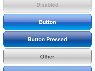
Look and feel-wise...the iOS look is getting dated. I don't think they should parrot the flat square look Microsoft is going for nor the Tron look in Android. But this
I'm not a visual designer so I'm not sure I'm entirely qualified to offer suggestions, but there are other button styles, even completely new ones that would work.
Some ideas:
How about some variation on the one in the upper right here?
Let's not go for shiny kitsch, let's go for expensive sports car with a matte paint job.
Other than that, cross app communications (intents) and resolution independent layouts as an option would be nice and get Apple out of this weird resolution multiplier lock it seems to be trying to bust out of (with the exception of the iPhone 5).
How about other interface bits? There's a button and the screen, how about capacitive edges that can be used for interface sliders or other things? I love capacitive buttons on Android phones (when they had them).
Or let's get crazy, a completely disappearing product all together. Jam the guts into a watch, and a small wireless earpiece, or maybe ear/eyepiece and voice controls and a capacitive touch panel on the watch, don't make it look gaudy like Google Glass, get top eyewear designers to pump out different headpieces (lots of upsale potential there) etc. etc. and top watch designers to design the handpiece and turn computing into ubiquitous wearable fashion driven computing (with sales cycles as fast as the fashion industry -- seasons) and people will buy 4 sets of devices a year instead of one every two years.
"At a glance can the average user tell the difference between iOS 2 or 3 and 6?"
(A) Probably can't tell because iOS 6 is on all the phones, zing!
(B) If he's trying to cut and paste he can tell. iOS 2 won't let him do it, iOS 3+ will force him to copy the entire body text randomly, iOS 5+ will randomly offer a handful of options that generally do not include the one the user is looking for.
(C) Ok, so it's visually stagnant. I guess I'll agree here. Turns out, there's usually less to disagreements than first glance might indicate.
"any fundamental work on improving the user interaction and look & feel of the thing in 5 years."
There are certainly new gestures and there's voice. There's new functionality in the buttons and from the lock screen. I would not say this is totally accurate.
"I find it unbelievable that there's nothing that could be done better and that iOS was launched with perfect interaction design, fully formed from the heads of the designers, or perfect visual design, reverently propagated to the modern day and on into the future."
I don't see anyone claiming it's perfect but there's a good argument to be made that Good Enough + Consistent > Better. Which is to say that Apple users, who do get updated to the latest patch, might be jarred if Apple constantly yanked the UI here and there for the sake of slight benefits or "keeping the look fresh".
I think it's a tremendous strength that the design hasn't needed to drastically change in 5 years and stay competitive. A lot of people are still getting their first iDevice. If you google "android home screen"
you'll get a cacaphony of different interfaces. Android may be "converging" on the right design, a potentially better design, but meanwhile people are suffering through all sorts of inconsistencies. For the vast majority of people who want their phones to "just work", Apple's approach is better [design it right, up front, in a way that can be used for years].
That's the advantage to great design, it doesn't need to change. Every year Android/Windows comes out with a new design that's finally supposed to make it not suck. Go find a 1984 Mac, look into the top right hand corner, whats there?
Agreed, I don't see the need for change, the incremental updates have gotten us to the point where iOS functions very well. If you're looking for innovative UI there are over 600,000 apps, many of them with amazing and novel UIs very well suited to the app's function.
Home screen and notification center widgets don't interest me. But if you could put something like widgets/live tiles/google now-ish space on the lock screen? Particularly with the increased vertical space? That'd be slick.
And intents/services are overdue. Particularly now that they're basically "in" with twitter/Facebook integration. I'm all for having more app store approval scrutiny for third party "services" submissions. But it needs to be in.
while we're asking, it wouldn't hurt to add the "taller"/redesigned task switcher UI that made the rounds recently.
"A lot of times, people don't know what they want until you show it to them." -- Steve Jobs
That's not our job to think about what Apple could do to improve our lives. Personally, I've loved Don't Disturb Me since it came out but it sure wasn't an iOS-exclusive feature. Neither has been turn-by-turn navigation.
I don't want iOS to play the keep-up game. I want it to continue being the industry leader, the game changer, the OS everyone else looks up to.
And surely, you cannot disagree that iOS has kind of lost that status since iOS 4.x.
Text selection mostly still sucks, there isn't any ability for third-party developers to modify the systemic behavior, there isn't any ability to allow different user accounts, as most PC OS's do.
In a world of apps, who gives a rat's ass about whether turn by turn directions are built-in (pretending Apple incorporated them into the OS rather than just branding an app developed in house)?
What matters is the quality of the directions, not that they are marketed with a lower case "i".
I'd say it is stagnant because when you look at the design, it just feels old. I'm not much of a designer, I can't tell you why, but it just seems dated. Perhaps it is the skeuomorphism, maybe something else, but something is off about it now.
It feels old because it hasn't changed in 5 years, but I personally appreciate that. All of the original mechanics make perfect sense, and the new mechanics (such as app folders and multitasking) have been introduced in a way that minimizes interference with the existing look and feel. As someone who uses a lot of music production apps that can't talk to each other, I do wish there was something like a filesystem, but I also want it to be introduced in a way that does not change the basic look and feel of the device.
What's amazing is that an original iPhone and iPhone 5 look and feel largely identical for basic uses, even though the latter is a far more capable device. That's a testament to the strength of the original design.
this is the same thing thats spouted by fans of the iphone. We don't need a smaller ipad 10" is the perfect size. We don't need a bigger phone screen, this fits the perfect size for all hands. All this is said till Apple actually does it.
I'm not saying that there's no room for improvement. Frankly, I want a smaller iPhone, a pressure-sensitive display, and a physical button to take a picture that's always active. What I don't want is for any of these improvements to fundamentally change the way the phone UX works (i.e. moving to a menu system or something).
The only "bad" design elements, in my opinion, were notifications and Siri. They fixed notifications but I had to turn Siri off.
> It feels old because it hasn't changed in 5 years, but I personally appreciate that.
And I think Apple is betting on a "conservative" majority that does not want change for the sake of change (I'm certainly part of it) - just observe how similar all the iPhones look, or all the laptops, displays... The only exception I can think of are the cheaper iPods.
And that's because they are cheap enough to buy on impulse, and/or to make an affordable gift for the holiday season that is clearly the hottest and newest available.
It was pretty clear that he was talking about visual design and interaction. None of the things you list here are in that domain. One is a new app, one is a voice UI and one is an Internet-based storage service.
"None of the things you list here are in that domain. One is a new app ..."
Since the very sentence I was responding too was about apps ("iOS is stagnant, reviews of recent Apple designed skeuo-heavy apps bemone the lack of functionality") I fail to see how talking about app functionality is some huge leap of logic on my part.
"he was talking about visual design and interaction. None of the things you list here are in that domain"
Didn't know you meant visual(design and interaction). Still though, it's a little frustrating to say they've stagnated. Apple is very, very long-term focused.
Wasn't Siri bought from another company which was already competing against similar products like Vlingo? Saying Apple pioneered it is a bit of a stretch. Especially considering how effective Android's voice commands were well before Siri was introduced.
It's more or less Symbian or Palm Pilot with touch. What was groundbreaking in terms of interface was the method of input not the way the OS was designed. It's still just icons and a pointer.
I see a lot of this type of sentiment here on HN, and I think it is because we are people who build technology and therefore study technology obsessively. Anything that stays the same for 5 years will feel ancient.
Most people, though, just want to use technology to accomplish other things. For them, radical interface changes reduce rather than improve value.
iOS has barely changed in UI since it's inception. That's not a good thing. No one designs the perfect design the fist time, nor the 100th time, nor ever. The goals and targets change and the design evolves. There has been no evolvement.
Sure, there's more precise releases than it's competitors, but that doesn't negate the fact that Windows has a more functional-looking (whether or not it is, is an entirely different matter) phone.
The Notification centre was a step in the right direction, but people are wanting data quicker more and more, and the notificiations aren't great for every app. After all, a big reason people cite for going for Android is customisation.
When the iPhone was released it was the absolute leader in mobile iOS among other things. Now it's a solid competer but it lacks the originality it once had.
The original MacOS design wasn't 'perfect' but it was very, very good. And Apple messed with it at their peril. They gave themselves a similar bar with iOS 1.0 - they know a lot about interaction design, and how to make a UI feel smooth and intuitive, and they aren't going to scrap all of those good decisions for the sake of looking new.
By contrast Microsoft have some interesting design ideas but they abandon them in the very next major version in favour of trying something else, which is jarring for users and doesn't inspire trust.
Android was listing screen capture as a new feature not long ago which hardly suggests a breakneck pace of change across the board.
Windows phone tiles are interesting but they don't feel game changing.
Is this an iOS thing or wider than that? Genuine question because if it was iOS alone then surely it would be eating Android's dust right now and that doesn't feel like it's the case, it feels like they're pretty much on a par.
(Just say I'm not wild about the word stagnant given that this is a market that has gone from nought to sixty in about the same time as it takes MS to get a version of Windows out, but it does feel like that pace has somewhat plateaued in the last 12 months or so).
Windows Phone 8 has a totally different and new paradigm going with merging start screen and "notifications bar" with the live tiles. Rooms with its "all sharing feature". Kids stuff. Lockscreen apps. All of these are a totally new approach to the mobile platform.
I feel the "new Microsoft" is really innovating(i hate that word) atm.
The Windows Phone UI is the one thing in my mind that actually is different, though I have a little skepticism about it as I'm not convinced that it's solving a problem many people actually have (certainly not one I or most people I know have) and it doesn't seem to be something consumers are queuing up to get their hands on. Meaningful innovation surely has to be something for which there is a demand?
Kids corner I would love on my iPhone but it's a more polished version of what I can do with restrictions so I'm not really sold on it being that revolutionary.
iOS only seems stagnant because they don't have to trumpet every year about how they've finally gotten rid of ui lag..
You might not notice it, but, there is an eighth-of-a-second-ish delay between when you tap on most buttons and when the action occurs. An obvious (to me) example is when you tap on the back button on a navigation controller, and it takes a split second before anything happens..
It isn't much, but it is consistent across the OS, and it drives me crazy.
Is that from touch down or touch up? Most controls respond on the release because holding down or dragging is a different action in many (maybe most) cases.
I'm not perceiving much lag between touch up and animation start on the back button of the UINavigationController.
I believe this is deliberate - giving a user a sense of what they did which results in the next action. This is especially important if the button you've pressed takes you to another screen.
> Between Siri and the maps screw up the decision made itself.
Care to explain what is the issue with Siri? I use it every day to organize my day (with dozens of meetings and reminders) and it works perfectly fine.
I can kind of see your point with iOS6 Maps. But only to a point. Yes, it did start out really badly. I reported 3 issues that got fixed the next day (literally). One of those issues was also on Google Maps and is still broken there. Since then I haven't seen any problems with quality of data. I do miss Street View, but day to day, the app is fine.
Speaking of maps, when Tim Cook wrote the maps apology letter, he mentioned the Waze application. I've never heard of it till that day and, man, what a great app. Whenever I find myself in a traffic situation, I always fire it up. As far as point to point direction, it is second to none, routing me around traffic jams and standstills of the LA area.
The way I understand it is that skeuomorphism is about using design to elicit elements or interactions that formerly served a purpose (i.e. making a keyboard look like typewriter keys), whereas path-dependence is about current schemes whose continuing popularity is more due to a quirk of history that gave its use better returns rather than being proven against others (i.e. the QWERTY keyboard).




iOS is stagnant, reviews of recent Apple designed skeuo-heavy apps bemone the lack of functionality -- while noting what must be hundreds of hours of graphics work -- and not seeing that the tradeoff is worth it. With finite development hours the general public realizes that they'd rather get shit done then look really great sorta getting some things done.
So who makes the money at Apple? It's two people, Cook and Ive -- supply chain and product design. Let's give turning the entire device design over to a holistic human interface designer a try instead of running hardware and software as two disjoint efforts.
Between Siri and the maps screw up the decision made itself.